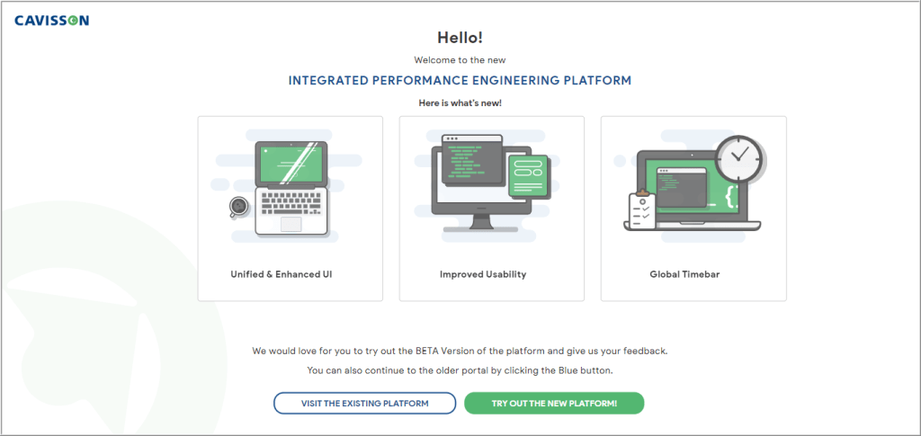
Release 4.7.0 is intended for a major revamp of Cavisson products in a new unified interface. This document provides information about the new Unified Dashboard, enhancements, and performance improvements in Cavisson products.
Integrated Performance Engineering Platform
Cavisson introduces the Integrated Performance Engineering Platform to enrich your experience by providing an end-to-end capability within a unified dashboard. The unified dashboard framework enhances the agility and enriches the capabilities where the performance users can navigate issues faced on the browser and can drill-down to method level issues and corresponding logs. This capability provides a seamless integration of multiple Cavisson Products, such as Application Performance Management (APM), User Experience/Session Monitoring, and Log Monitoring.
Integrated Performance Engineering Platform Capabilities
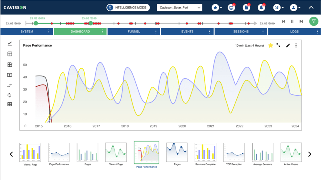
Unified Dashboard
The new Dashboard is more interactive with enhanced colors, better layout, and improved performance. It includes the following features:
Canvas Mode
Canvas Mode (or Design mode) is a feature provided in Cavisson Dashboard where you can design customized layouts of pages for report generation. You are facilitated with a Design mode interface where a mix of widgets, such as Graph widget, Tabular widget, Data widget, Image widget, and Text widget can be used. You can also import a file in which columns are delimited with a separator, and plot a tabular widget from the file data. You can also separate pages using the Page breaker and insert further widgets page-wise.
New Gallery Layout
With this approach, you can view the widgets in a gallery layout where the selected widget is displayed in the enlarged form on the panel and the rest of the widgets are displayed in the form of a film strip at the bottom of the window. You can select a widget from the bottom section and can move the strip by using the arrow buttons. For more information, see Dashboard Google Docs
Access Control List (ACL)
Access Control List is now supported in the Unified Interface. Access control list performs identification, authentication and accountability of entities through login credentials including passwords. Access can be provided for data (Tier, Project, Sub-Project), for features, for favorites, and data density. These accesses can be defined to Capabilities, which can be assigned to a group of users. One more capability is added as a ‘Developer’ capability.
Different Access Levels
- Access to First level of metric hierarchy (Mostly Tier)
- Access to Project/Sub-Project
- Access to read/write for features for advance users
When you create a favorite, you can define it as Private or Public. The private one is accessible to the owner only (not visible to others) and the Public one is accessible by all the users and ACL can be implemented on it. As ACL is based on data, whatever the tiers are assigned to that user are accessible.
For example:
- If the favorite is having write access for all the tiers to the user then favorite is available in edit mode (write mode).
- If a tier doesn’t have an edit facility but has a view facility then that favorite is accessible only in view mode.
- For any tier, for which the user doesn’t have the view permission , the whole favorite will not be visible to the user.
For more information, see Configuration – Admin Google Docs.
Visual Representation of Performance Measures
The selected graph is highlighted and its details are displayed on the lower panel. The rest of the graphs are displayed as a blurred format in the background. In the same way, when you select a graph from the lower panel, it gets highlighted on the graph panel and the rest becomes blurred. For more information, see Dashboard Google Docs.
Cluster Monitoring
This feature provides you the capability to monitor multiple data centers within a single dashboard. In current days, all the e-commerce applications are moving into multiple data centers to accommodate the application complexity. Monitoring capability is enhanced with the evolution of multi DC in a single dashboard. This advanced technology enables you to use a single dashboard to monitor multiple data centers. There is a master data center among all the data centers, which allows you to view the Dashboard of all the data centers.
Run Command
The Run command feature is now supported in the Unified Interface. This is used to run commands on a server from UI, without using backend access.
Pattern Matching
Pattern-Matching describes the degree of relationship between the metrics on the basis of threshold value. It finds and displays those metrics which are having the same pattern. Below features in pattern matching are now supported by the Unified Interface. For more information, see Dashboard Google Docs
- Pattern Matching
- Inverse Pattern Matching
- Catalog Management
Catalog Management
A Catalog Management option is provided from the Configuration menu as Catalog management is used globally with Pattern Matching and Open Related members. For more information, see Configurations – Basic Google Docs.
Audit Log
Audit log displays the activity log details of all users. Initially, it displays the number of users currently logged in. In Audit log, entries are populated in audit log files for only those actions of users, which affects the user’s object, such as add, edit, update, delete. Audit log is a separate feature whose permission can be provided to a user, by default the user has the permission to see own audit logs. If we assign audit log feature capability to any user, he/she can see all the activities performed by the user logged in to that machine. For more information, see User Options Google Docs.
Metrics Tree
The tree structure displays all the metrics available in the current session. The metrics is displayed within the hierarchy of Group i.e. Metric Group, Subject, Attribute Group and other components, such as Tier, Server, and Instance. You can also search a Group / Metric / Component using the search feature. For more information, see Dashboard Google Docs
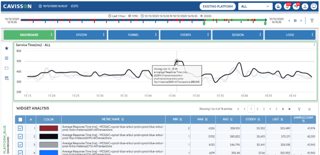
Lower Panel
Lower pane displays data of all the graphs of the selected panel. The data is displayed in Tabular format. It is located at the bottom of the Dashboard UI.
Show Metric Data
The graph data is displayed for the specified time period with information, such as sample time, and details of that particular graph.
- To navigate to the pages, use the navigation button displayed at the bottom.
- You can also download the graph data in various formats, such as PDF, Excel, or Word.
- You can apply filters on columns and can configure which columns to see and hide.
- You can see the sample interval time along with session number and average count
Favorites and Layouts
Favorites are the frequently used dashboard which you save in your profile for quick loading and avoid the effort of recreating it all over again. In the current context, favorites comprises a group of charts from different metrics. Favorite allows you to add and save current views of graphs to view in future in favorites. When you load a saved favorite, then all graphs of favorite are displayed on the graph panel of Favorite and you can do widget Operation as well. For more information, see Dashboard Google Docs
Dashboard introduced various types of layouts. One layout is a combination of different types of widgets of different sizes. There are predefined layouts bundled with the product. You can create a new custom layout also.
Scaling
This feature is added to reduce the visualization and interpretation complexities arising from having a large as well as small graph values on the same widget. Scaling enables distinct display of very small values compared with very high values on the same widget. Two scaling modes are provided, logarithmic and auto.
Key Pointers
- Scaling can be changed/applied from the widget.
- If the scaling option is changed/applied from the widget, then it is applicable on that widget only.
- If scaling by specified metrics is selected, then on selection of metrics from lower pane or from widget, the scaling is changed.
- From the configuration UI, you can change the default option of scaling.
- Using the Scaling Threshold value, you can scale the graph as and when needed and can calculate the Scale Factor based on that.
- The graphs, which are being scaled, are displayed with the dash and dotted line respectively.
Dual Axis Chart Type
In a Dual axis graph, there are options to select the primary metric. Primary metric is displayed on the left side of the graph and other metrics are displayed on the right side.
Derived Graph
Derived graphs are those graphs that are derived from two or more graphs by applying some formulas. In this release some new features are added, such as Group By and Advanced.
- Group By: The term ‘Group By’ stands for aggregation of data. It is a mechanism for the creation of derived metrics by grouping two or more metrics at any hierarchical level (or multiple hierarchical levels) based on some functions, such as average or sum. This mechanism is provided to take care of some special cases where hierarchy doesn’t make much sense and you would like to see the data in a different hierarchical order.
- Advanced: These new metrics can be derived from the existing single or multiple metrics by applying some functions and formulas.
Time Period
Time Period is used to filter the data based on certain time/period.
Preset
- Live: To view live data. For example – Last 5 minutes, Last 10 minutes, Last 30 days, This week, This Month, This year.
- Past: To view past data. For example – Last week, Last 2 weeks, Last 2 months, Last year.
- Events: To view data for some specific events. For example – Black Friday, Christmas Day, Good Friday, Cyber Monday.
- Time Back: To view data for time back. For example:
- Hour Back – To select the same period as the current N hours back.
- Day Back – To select the same period as the current N days back.
- Week Back – To select the same period as the current N weeks back.
- Month Back – To select the same period as the current N months back
- Last Week Same Day – To select the same period as the current from the same day of last week.
- Last Month Same Date – To select the same period as the current from the same date of last month.
- Custom Time: To fill the start & end date and time. It is enabled when you do not select the Preset
View By
This is used to specify the format of aggregated data (such as hours, minutes, and seconds) based on the selection of the Preset option. View by contains the following options:
- Auto: It is used to select sample intervals automatically as per duration of compared measurements.
- Second: It contains the values, such as 10 Sec, 20 Sec, 30 Sec, 40 Sec & 50 Sec.
- Minute: It contains the values, such as 1 Min, 2 Min, 4 Min, 5 Min, 10 Min, 15 Min & 30 Min.
- Hour: It contains the values, such as 1 Hours, 2 Hours, 4 Hours, 6 Hours & 12 Hours.
Widget Settings
Here, you can specify layouts of the widgets using various configurations:
- Graph Type Widget: Convert chart into any type of chart, Convert graph into any type of graph according to formula type, Legend Setting, Widget Delay Time, Caption Settings, Compare Baseline, Hide Chart Axis, Color Settings, Display Section
- Data Type Widget: Data Widget Settings, Display Name, Severity Definitions, Caption Settings, Color Settings, Display Section, prefix, suffix
- Tabular Type Widget: Convert data according to table type (graph based and vector based both are supported), caption Setting, Color Settings, Display Section
- System health Type Widget: Health Widget Settings, show metric on top, severity definitions, health rules, color Settings, Display Section, Caption Settings, validations
- Label Type Widget: Label text, Color Settings, Display Section,
- Favorite by filter, favorite by parameterization.
Note: Widget Drill down is supported but dashboard page option is not supported yet. For data and System health right now we have supported the same font family for value and label.
For more information, see Dashboard Google Docs
Open/Merge/Compare Metrics
- Open: To open metrics of the same group on the different widgets based on the selection criteria (all, zero, non zero).
- Merge: To merge metrics of the same group on a single widget based on the selection criteria (with active widget, all, zero, non zero).
- Compare: To compare metrics of the same group based on the selection criteria (all, zero, non zero).
Compare
Compare option is used to compare two or more measurements. Measurement is the set of periods to be compared. In the case of Netstorm, Test run is also termed as measurement. Features include Normal compare, Trend Compare, WidgetWise Compare for both Normal compare, Trend Compare, Time Back feature, New UI Look and feel, and Lower Panel for Trend Compare, Normal compare.
Normal Compare with Multiple Metrics on Widget
Compare with multiple metrics includes the following features:
- Current and its measurement graphs are displayed with the same color for a metric.
- Current graph line is displayed as a solid line but other measurement lines are displayed with different types.
- If ‘current’ is not included in the compare then no solid line is displayed.
Open Related
This functionality is used to open such metrics from the tree, which have related hierarchies in the same or across groups. This option is displayed for any hierarchical component of the subject value like tier, server, instance, Interface, Destination, DiskPartition, Processor etc. It has four sub-menus. It can be an exact match or a partial match.
Template Creation
A template is a well-defined structure of information gathered from graphs. You need not to recreate the file each time. Once a template is created, it can be reused further. Therefore, if you find creating similar reports repeatedly, it might be a good idea to save one of them as a template. Then, you do not have to format reports each time to make a new one.
Reports
Reports UI is converted to a unified interface. Reports is a reporting module available in the Cavisson products. These reports are generated using Templates. You can select the reporting format as Word, HTML, or Excel. It includes tabular data with or without graphical illustration.
It includes:
- Metrics Report
- Drill Down Reports
- Ready Reports
Report Scheduler
You can schedule a report by specifying certain information. Scheduling is performed to generate reports on continuous intervals.
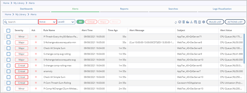
Events (Alerts)
Active Alert UI
You can view active alerts (the alerts which are currently in active state).
Cluster Monitoring
This feature provides you the capability to monitor multiple data centers within a single dashboard. In current days, all the e-commerce applications are moving into multiple data centers to accommodate the application complexity. Monitoring capability is enhanced with the evolution of multi DC in a single dashboard. This advanced technology enables you to use a single dashboard to monitor multiple data centers. There is a master data center among all the data centers, which allows you to view the Dashboard of all the data centers.
Run Command
The Run command feature is now supported in the Unified Interface. This is used to run commands on a server from UI, without using backend access.
Pattern Matching
Pattern-Matching describes the degree of relationship between the metrics on the basis of threshold value. It finds and displays those metrics which are having the same pattern. Below features in pattern matching are now supported by the Unified Interface. For more information, see Dashboard Google Docs
- Pattern Matching
- Inverse Pattern Matching
- Catalog Management
Catalog Management
A Catalog Management option is provided from the Configuration menu as Catalog management is used globally with Pattern Matching and Open Related members. For more information, see Configurations – Basic Google Docs.
Audit Log
Audit log displays the activity log details of all users. Initially, it displays the number of users currently logged in. In Audit log, entries are populated in audit log files for only those actions of users, which affects the user’s object, such as add, edit, update, delete. Audit log is a separate feature whose permission can be provided to a user, by default the user has the permission to see own audit logs. If we assign audit log feature capability to any user, he/she can see all the activities performed by the user logged in to that machine. For more information, see User Options Google Docs.
Metrics Tree
The tree structure displays all the metrics available in the current session. The metrics is displayed within the hierarchy of Group i.e. Metric Group, Subject, Attribute Group and other components, such as Tier, Server, and Instance. You can also search a Group / Metric / Component using the search feature. For more information, see Dashboard Google Docs
Lower Panel
Lower pane displays data of all the graphs of the selected panel. The data is displayed in Tabular format. It is located at the bottom of the Dashboard UI.
Show Metric Data
The graph data is displayed for the specified time period with information, such as sample time, and details of that particular graph.
- To navigate to the pages, use the navigation button displayed at the bottom.
- You can also download the graph data in various formats, such as PDF, Excel, or Word.
- You can apply filters on columns and can configure which columns to see and hide.
- You can see the sample interval time along with session number and average count
Favorites and Layouts
Favorites are the frequently used dashboard which you save in your profile for quick loading and avoid the effort of recreating it all over again. In the current context, favorites comprises a group of charts from different metrics. Favorite allows you to add and save current views of graphs to view in future in favorites. When you load a saved favorite, then all graphs of favorite are displayed on the graph panel of Favorite and you can do widget Operation as well. For more information, see Dashboard Google Docs
Dashboard introduced various types of layouts. One layout is a combination of different types of widgets of different sizes. There are predefined layouts bundled with the product. You can create a new custom layout also.
Scaling
This feature is added to reduce the visualization and interpretation complexities arising from having a large as well as small graph values on the same widget. Scaling enables distinct display of very small values compared with very high values on the same widget. Two scaling modes are provided, logarithmic and auto.
Key Pointers
- Scaling can be changed/applied from the widget.
- If the scaling option is changed/applied from the widget, then it is applicable on that widget only.
- If scaling by specified metrics is selected, then on selection of metrics from lower pane or from widget, the scaling is changed.
- From the configuration UI, you can change the default option of scaling.
- Using the Scaling Threshold value, you can scale the graph as and when needed and can calculate the Scale Factor based on that.
- The graphs, which are being scaled, are displayed with the dash and dotted line respectively.
Dual Axis Chart Type
In a Dual axis graph, there are options to select the primary metric. Primary metric is displayed on the left side of the graph and other metrics are displayed on the right side.
Derived Graph
Derived graphs are those graphs that are derived from two or more graphs by applying some formulas. In this release some new features are added, such as Group By and Advanced.
- Group By: The term ‘Group By’ stands for aggregation of data. It is a mechanism for the creation of derived metrics by grouping two or more metrics at any hierarchical level (or multiple hierarchical levels) based on some functions, such as average or sum. This mechanism is provided to take care of some special cases where hierarchy doesn’t make much sense and you would like to see the data in a different hierarchical order.
- Advanced: These new metrics can be derived from the existing single or multiple metrics by applying some functions and formulas.
Time Period
Time Period is used to filter the data based on certain time/period.
Preset
- Live: To view live data. For example – Last 5 minutes, Last 10 minutes, Last 30 days, This week, This Month, This year.
- Past: To view past data. For example – Last week, Last 2 weeks, Last 2 months, Last year.
- Events: To view data for some specific events. For example – Black Friday, Christmas Day, Good Friday, Cyber Monday.
- Time Back: To view data for time back. For example:
- Hour Back – To select the same period as the current N hours back.
- Day Back – To select the same period as the current N days back.
- Week Back – To select the same period as the current N weeks back.
- Month Back – To select the same period as the current N months back
- Last Week Same Day – To select the same period as the current from the same day of last week.
- Last Month Same Date – To select the same period as the current from the same date of last month.
- Custom Time: To fill the start & end date and time. It is enabled when you do not select the Preset
View By
This is used to specify the format of aggregated data (such as hours, minutes, and seconds) based on the selection of the Preset option. View by contains the following options:
- Auto: It is used to select sample intervals automatically as per duration of compared measurements.
- Second: It contains the values, such as 10 Sec, 20 Sec, 30 Sec, 40 Sec & 50 Sec.
- Minute: It contains the values, such as 1 Min, 2 Min, 4 Min, 5 Min, 10 Min, 15 Min & 30 Min.
- Hour: It contains the values, such as 1 Hours, 2 Hours, 4 Hours, 6 Hours & 12 Hours.
Widget Settings
Here, you can specify layouts of the widgets using various configurations:
- Graph Type Widget: Convert chart into any type of chart, Convert graph into any type of graph according to formula type, Legend Setting, Widget Delay Time, Caption Settings, Compare Baseline, Hide Chart Axis, Color Settings, Display Section
- Data Type Widget: Data Widget Settings, Display Name, Severity Definitions, Caption Settings, Color Settings, Display Section, prefix, suffix
- Tabular Type Widget: Convert data according to table type (graph based and vector based both are supported), caption Setting, Color Settings, Display Section
- System health Type Widget: Health Widget Settings, show metric on top, severity definitions, health rules, color Settings, Display Section, Caption Settings, validations
- Label Type Widget: Label text, Color Settings, Display Section,
- Favorite by filter, favorite by parameterization.
Note: Widget Drill down is supported but dashboard page option is not supported yet. For data and System health right now we have supported the same font family for value and label.
For more information, see Dashboard Google Docs
Open/Merge/Compare Metrics
- Open: To open metrics of the same group on the different widgets based on the selection criteria (all, zero, non zero).
- Merge: To merge metrics of the same group on a single widget based on the selection criteria (with active widget, all, zero, non zero).
- Compare: To compare metrics of the same group based on the selection criteria (all, zero, non zero).
Compare
Compare option is used to compare two or more measurements. Measurement is the set of periods to be compared. In the case of Netstorm, Test run is also termed as measurement. Features include Normal compare, Trend Compare, WidgetWise Compare for both Normal compare, Trend Compare, Time Back feature, New UI Look and feel, and Lower Panel for Trend Compare, Normal compare.
Normal Compare with Multiple Metrics on Widget
Compare with multiple metrics includes the following features:
- Current and its measurement graphs are displayed with the same color for a metric.
- Current graph line is displayed as a solid line but other measurement lines are displayed with different types.
- If ‘current’ is not included in the compare then no solid line is displayed.
Open Related
This functionality is used to open such metrics from the tree, which have related hierarchies in the same or across groups. This option is displayed for any hierarchical component of the subject value like tier, server, instance, Interface, Destination, DiskPartition, Processor etc. It has four sub-menus. It can be an exact match or a partial match.
Template Creation
A template is a well-defined structure of information gathered from graphs. You need not to recreate the file each time. Once a template is created, it can be reused further. Therefore, if you find creating similar reports repeatedly, it might be a good idea to save one of them as a template. Then, you do not have to format reports each time to make a new one.
Reports
Reports UI is converted to a unified interface. Reports is a reporting module available in the Cavisson products. These reports are generated using Templates. You can select the reporting format as Word, HTML, or Excel. It includes tabular data with or without graphical illustration.
It includes:
- Metrics Report
- Drill Down Reports
- Ready Reports
Report Scheduler
You can schedule a report by specifying certain information. Scheduling is performed to generate reports on continuous intervals.
Events (Alerts)
Active Alert UI
You can view active alerts (the alerts which are currently in active state).
Unified SaaS Login
There is a unified SaaS login (or a single sign on) from where you can get access to all the clusters. You just need to click the cluster name for which you need to view the data as per your requirements without login repeatedly for multiple clusters.
Below SaaS features are now supported in the Unified Interface:
- Project Account Management
- Enterprise Home
- SaaS Controller Login
Diagnostics Tools
Below diagnostics tools are now supported in the Unified Interface:
- Heap Dump
- Thread Dump
- Process Dump
- TCP Dump
- Mission Control
- Java Flight recording
- GC Viewer
Agent Config
You can now configure APM Agent from the Agent Config window via Unified Interface. The APM Configuration window is divided into two panes – left pane and right pane. Left pane consists of a menu from which, on clicking it, the corresponding details are displayed on the right pane. From the right pane, you can configure the application, profile, and instrumentation profile. You can also view the complete list or top five topologies from the Topology list section. Application list, profile list, and topology list is displayed on the right pane by default.
Monitoring Exception and Variables Capturing (Overops Compatibility)
This feature enables you to capture method arguments, local variables, and class fields of the methods present in the stack trace of Exception.
Transaction-Based Log Level
By enabling this feature, an agent can change the log level of the application for a particular request at run time. For Example, earlier, if an issue arises in the application, then to debug that issue, the client needed to increase its log level manually. Once the application log level increases, the application starts dumping all the logs of each request and it becomes very hard to debug that issue. Now, after providing this feature, the agent will only increase the log level of that particular request which causes an issue into the application and so it will reduce the time taken to resolve the issue. For more information, see Dashboard google doc.
Mutex Lock Profiling
Lock profiling enables you to understand the lock contention and blocking thread behavior of your applications over time. It helps you identify method calls in the context within which most locks for resources were allocated and combine this information with the number of allocated objects.
Added support for capturing information with respect to blocking thread, i.e. if a thread acquires a lock then how many other threads are getting affected due to it. In this case we will be capturing blocking time and blocking count for the thread which has acquired lock, and block count of the threads getting blocked due to it.
Memory Profiling (Java Agent and .Net Agent)
Heap profiling (memory profiling) enables you to understand the memory allocation and garbage collection behavior of your applications over time. It helps you identify method calls in the context within which most memory was allocated and combine this information with the number of allocated objects. The Survivor perspective helps you to understand the context within which your long-living objects (objects that survive multiple garbage collection cycles) are created. This is supported for Java and .Net Agent.
Tier Group, Agent Info, and Tier Assignment Rule
- Tier Group: Tier group defines the complete window view of Tiers involved in the list of Topology. From here, you can directly configure the tier group list. After selecting a particular topology, you get a Tier list group, which defines some additional attributes information, such as Group name, Group defines for, type, etc.
- Agent Info: Here, you can view a list of APM agents along with their status. To view the APM agents list, click the Agent Info option within the Admin
- Tier Assignment Rule: This feature is used to configure tier names based on rules (such as Pattern of Server Name, Server List, Server IP range).
Store View
Store View / Geo Location adds global context to geographically distributed enterprise environments and provides administrators with greater awareness of what events are happening and where. For more information, see Dashboard google doc
Drill Down Reports
You can drill down various types of reports using the Drill Down link under the panel settings. Drill down contains various reports based on the metrics. It includes:
- Flowpath Report
- Flowpath Group by Business Transactions
- Flowpath Analyser Report
- BT Trend Report
- DB Request Report
- DB Request Group by Business Transaction
- Normal/Slow/Very Slow / Error Transaction
- Method Timing
For more information, see Dashboard google doc
Dynamic Logging
Dynamic logging feature allows you to add Trace Point on any line number of a method in application, third party, and core java library. Configuration of Trace Point allows capturing the following data:
- Method argument
- Local variables
- Class member variables
- Method return value
- Capture stack trace
- Add logs in application log files (or agent log file)
- Write logs to console
Other Enhancements
Dumping of Percentile Data inside a New Path with 8 hrs of Partition Switch
If TSDB mode is enabled, the data is dumped in a new path (TRXXXX/tsdb/202XXXXXXXX/percentile/).
This new partition will always be switched in 8 hrs and created on the basis of UTC time, like if UTC time is 5 march 2021 10:25 then partition will be 20210305080000, next partition will be 20210305160000. Partitions will always be created on the basis of UTC time.
TSDB Modes
- 0: Dump percentile data at original path.
- 1: Dump percentile data in a new path.
- 2: Dump percentile data in both original path and newly specified path.
Addition of Service Entry Points for Core Application
These are the Entry Points which are needed for DotNet core type applications and can be added from the Agent config UI. Initially, these Entrypoint were needed manually in the Backend profile, now onwards there is no need to add them manually. Just create a profile and get the DotNet application data either DotNet framework or core framework.
CORE FRAMEWORK ENTRY POINT
Microsoft.AspNetCore.Hosting.dll|Microsoft.AspNetCore.Hosting.HostingApplication.ProcessRequestAsync|HTTP_ENTRY|1|
Microsoft.AspNetCore.Hosting.dll|Microsoft.AspNetCore.Hosting.HostingApplication.DisposeContext|TX_EXIT|1|
Repeated Method Table Support for MCT in the Unified Interface
Repeated method table is now supported for Method Calling Tree in the Unified Interface. For more information, see Dashboard google doc.
Auto Instrumentation Support in IP Summary Report
Now, auto instrumentation support is provided in the IP Summary report via the Unified Interface. Auto Instrumentation eliminates the need of manually creating the instrumentation profile with packages / classes / methods of application. Auto instrumentation can be started on the server using configuration UI by invoking a new session called Auto Instrumentation Session.
Change in message if no changes applied
Instead of showing “Saved Successfully” it now displays as “No Changes Applied” after clicking the Save button if you do not change anything in Configuration.
Handling of Flowpath Analyzer Report based on the number of Patterns
Dynamic Handling of Flowpath Analyzer Report is implemented based on the number of Patterns. In addition, it also supports Flowpath Signature, Pattern Summary, and Top Method Data Table from the UI.
Flowpath Analyzer | Drilldown to Flowpath Report
Support is provided for Drilldown to Flowpath report on the click of the Flowpath count column in Flowpath Signature and Pattern Summary.
Flowpath group by BT report through Dashboard
You can now get a flowpath group by BT report through Dashboard.
Support AutoInstrumentation in Method Timing Report
Support is provided for AutoInstrumentation in Method Timing Report
- While drill down to method timing report
- Flowpath to method timing report
View Recorded variables in Exception report
You can view the recorded variables in the exception report via the Unified Interface.
Flowpath report from Flowpath group by BT through Dashboard
You can now view the flowpath report from the ‘Flowpath group by BT’ option via Dashboard.
DDR – Support for on graph click table filtering, legends in graph, graph color
Supported features are as follows:
- In a graph, click table filter table data.
- Show graph legends in pie charts.
- Graph color for pie chart.
Monitors
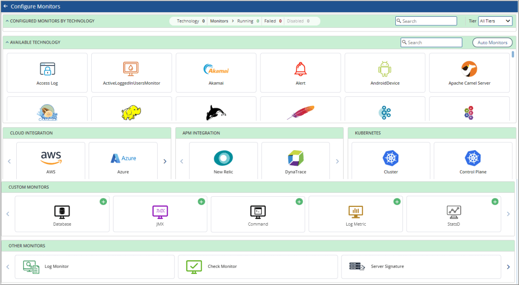
Monitor UI Redesign
New Monitors UI has an easy to comprehend user flow for quickly identifying the monitors configured and readily available options to configure new monitors based on technology deployed at our customer’s end.
DB Monitoring
DB Monitoring New UI includes the following features:
- DB Query stats
- Blocking Sessions
- Locks stats
- Sessions stats
- Wait Statistics
- Deadlocks
- IO By File stats
- TempDB
- Batch Jobs
- Database Stats
- Support Services
- Server Stats
- DB Query Logs
- Service Logs
Support to Monitor Dynamic CRM Metrics
The following monitors are added for CRM Monitoring:
- CRMAsyncServiceOrganization
- CRMAsyncServiceOperation
- CRMAsyncService
- CRMServer
- CRMAuthentication
- CRMOutlookSync
- CRMDiscovery
- CRMLocatorService
- CRMPlatform
- CRMRouterService
- CRMSandboxClient
- CRMSandboxHost
Multi-frequency
You can change the frequency to a lower / higher level for a monitor.
Data Recovery
If the test stops / crashes, TSDB will recover the data.
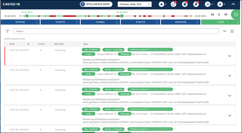
Logs
Using the Logs dashboard, you can view the query results in different formats, such as Histogram, Table, Request, Response, and Statistics.
Reports Scheduling and Emailing
From the Logs dashboard, you can schedule the report generation process by specifying the date and time for the report generation. The reports can be viewed in Tabular, Word, HTML, and PDF formats. You can also email the scheduled reports by specifying the date and time and the email address of the recipients. The reports can be shared in Tabular, Word, HTML, and PDF formats.
DDR Integration
Introduced Integration icons beside the logs table, which you can use in integration of Logs with APM, and User Experience / Session Monitoring.
Filtering Logs
You can now filter the search request by clicking the left field value.
Base URL Support
Base URL is added in the request URL which is sent from Log UI / Forwarder to DB. By default, “/netforest” is added in the request URL if no value is provided.
Working of Docstats with Multiple ‘Group By’ Field
Earlier, doctstats construct was working with a single bucket value. From now onwards, the doctstats will work with multiple buckets.
Earlier syntax: index=* query=*|docstats max(resptime) by tier
New syntax : index=* query=*|docstats max(resptime) by tier,server
Retrieve Search Feature for Saved Queries
You can save any query along with its output and can view the same on the saved search section. You can click on saved search and retrieve the saved query.
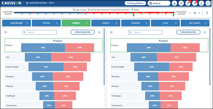
Conversion Funnel
The Funnel dashboard aims at showcasing the user journey in an application and also shows the vital statistics around which page experiences maximum drop-offs, which pages experience maximum forwards etc. Using the Funnel window, you can create a business process filter and compare business processes to analyze the user behavior on your website. Funnel Comparison provides an integral contextual information about how one page is performing with respect to the other page. For more information, see Funnel – Google Docs.
Session
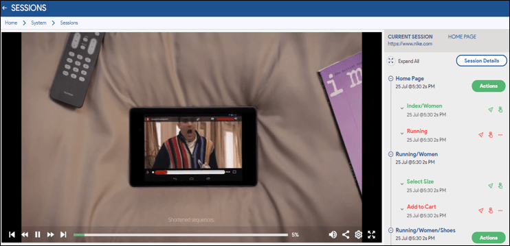
In the unified interface, the Session dashboard enables you to use the customer experience monitoring technology to analyze user interactions with a website. It provides extensive visibility into the online experiences and insight into customer behaviors within Web browsers. It enables you to visualize the performance and metrics of the pages accessed by a user. You can apply filters and interact with the Session dashboard to analyze the reports that are important to you. For more information, see Session – Google Docs.
Session Replay
Session Replay includes easy to spot icons for events and actions taken, making it easier to identify different steps/actions/events occurring in a session.
Detailed Session Information
Session Details page has been designed with the primary aim of giving our users maximum information for e.g. page information, app crash details, device and location information for a particular Session.
RTC Support in Multi-disc Settings
Added support for RTC in the multi-disc settings that enables users to reassign the multi-disc configuration without restarting the server.
Performance Testing
Able to View the Version History of Test Suites
Users can now view the version history of test suites, test cases, and check profiles using the Version Log option. This option will enable the users to analyze the changes committed by multiple users in any test case, test suite, Test report or check profile.
Removed Hyperlinks from Console O/P in Jenkins
Removed extra hyperlinks from the Console O/P of Jenkins.
Performance Enhancements
ID | Product | Description |
101297 | NetCloud | Able to view the left panel icons in a Multi DC machine. |
101935 | NetCloud | Able to delete any TR from the UI and the TR will not present in the /rawdata file. |
105960 | NetCloud | Renamed the Default first “runlogic” block name is “Block1” to “Start”. |
105962 | NetCloud | When dragging a flow into “%block”, the dialog box height for “Percentage” is now correctly displayed and resizable. |
106339 | NetCloud | Redirect port is the same in server.xml of the newly created blade from where the controller was created. |
107886 | NetCloud | Users are not getting dropped in load tests. |
98657 | NetDiagnostics | JavaKafkaTopicReplication monitors are displayed in the dashboard for cprod-kafka Tier. |
99437 | NetDiagnostics | Able to see log monitors in the monitor dashboard. |
99860 | NetDiagnostics | Able to generate alerts for taskScheduler monitor. |
106961 | NetDiagnostics | Oracle DB monitor running successfully. |
113953 | NetDiagnostics | Able to save the Instrumentation Profile from config UI. |
105656 | NetOcean | Index Dataset Parameter is working successfully. |
112018 | NetOcean | Able to create requests dynamically for Adobe Target service in Netocean by using query parameter and query parameter. |
103025 | NetStorm | Included an option to choose a random number within a range e.g. 1 – 100. |
106326 | NetStorm | Users are able to run tests successfully from the Test Run window. |
106405 | NetStorm | SessionContinueAfterPageErrorIssue” in Netcloud Generator Enabled test |
107317 | NetStorm | Script compatibility in Intellij |
111014 | NetStorm | JavaGC V2 monitor |
111287 | NetStorm | Metrics Display resolved |
112575 | NetStorm | Retention Policy working successfully. |
113604 | NetStorm | AMI Troubleshooting |
114272 | NetStorm | Getting core dump due to header file of library was missing in checkpoint code |
113998 | NetVision | Resolved cors_error on console. |
111660 | TestSuite | Overall status of the shell output matches with the report status. |
Features in Phase 2
Below is the list of features targeted for delivery in Phase-2:
Dashboard
- Overlay Events: Overlay events display stats of the alert generated in the graphs. You can get the alert events from Alert History. Based on its time stamp, you get annotations on the graph, to show the different types of Alerts (Critical / Major / Minor / Normal)
- Alert Maintenance: Alert maintenance window configuration is required to disable alert generation at the time of maintenance period or a scheduled down-time.
- Group Level Alerting: This is used to generate alerts based on the subject level – Tier / Server / Instance / Business Transaction. If the Metric Group is SysStats Linux Extended, Metric Name is CPU Utilization (Pct), and Specified Subjects are AppTier>QAServer3, AppTier>QAServer4, then the events are generated at group level i.e. for
- Alert Rule – Anomaly, Outlier, Forecast
- An anomaly detection alert uses the previous performance of a metric to spot when it is behaving unusually. Anomaly alerts analyze an estimated range of values for a series based on the previous time.
- Outlier monitors detect when a subject of a group is behaving unusually compared to the rest of the subjects during a specified time period.
- Forecast predicts the forthcoming performance of a metric and compares it to a fixed threshold. It is appropriate for metrics with robust trends or repetitive patterns.
User Experience / Session Monitoring
- Support Replay Selector
- Support Session Detail- Method Trace
- Support Task Scheduler