

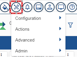
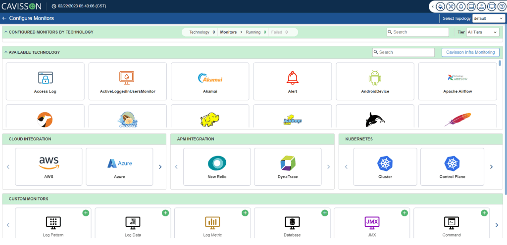
- Monitor: You can configure various monitors by clicking the Monitors button
 .
.
- Monitors by Technology
- Cloud Integration
- APM Integration
- Kubernetes
- Custom Monitors
- Auto Monitors
- Other Monitors
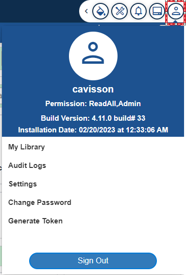
- Logged In Username: It is the username of the logged-in user.
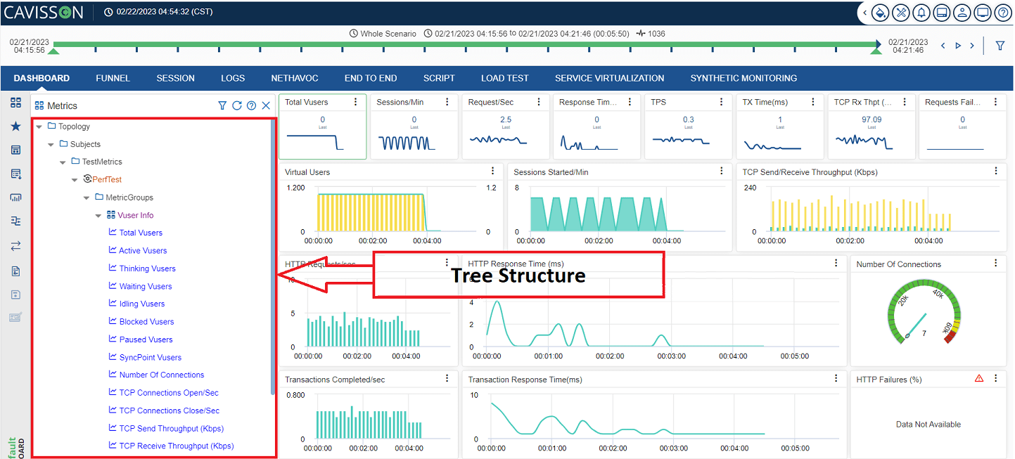
- My Library: You can navigate to further windows, such as Dashboard, Alerts, Reports, Favorites, Searches, Business Processes, and Visualization.
- Audit Logs: Audit log displays the activity log details (activity time, IP address, user name, session ID, module name, activity name, description, and response time) of all the users. At the top-right corner, the count of active sessions and active users is displayed.
- Settings: Here, you can configure the Profile setting (name, email, and job title) and Email/SMS setting (time zone, mail configuration, sms configuration).
- Change Password: This option is used for changing an existing user password.
- Generate Token: This authentication token verifies any rest call and informs the server that the bearer of this token has been authorized to access and perform a specific operation.
Note: The logged in user can also logout by clicking on the Sign Out ![]() button.
button.
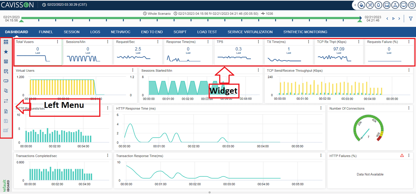
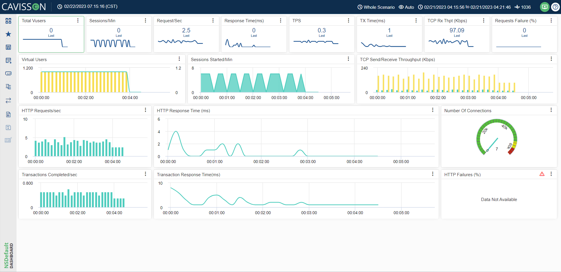
- TV Mode: TV mode is a feature used to monitor favorites in a single view. This fits the complete layout and displays it in a single frame. When you have a favorite with different layouts having a large number of widgets than to view all the widgets, there is no need to scroll up or down, just click the TV Mode button (
 ) and all the widgets are displayed in a single view. To go back to normal mode, click the
  button on the top-right corner of the window.
Normal Mode
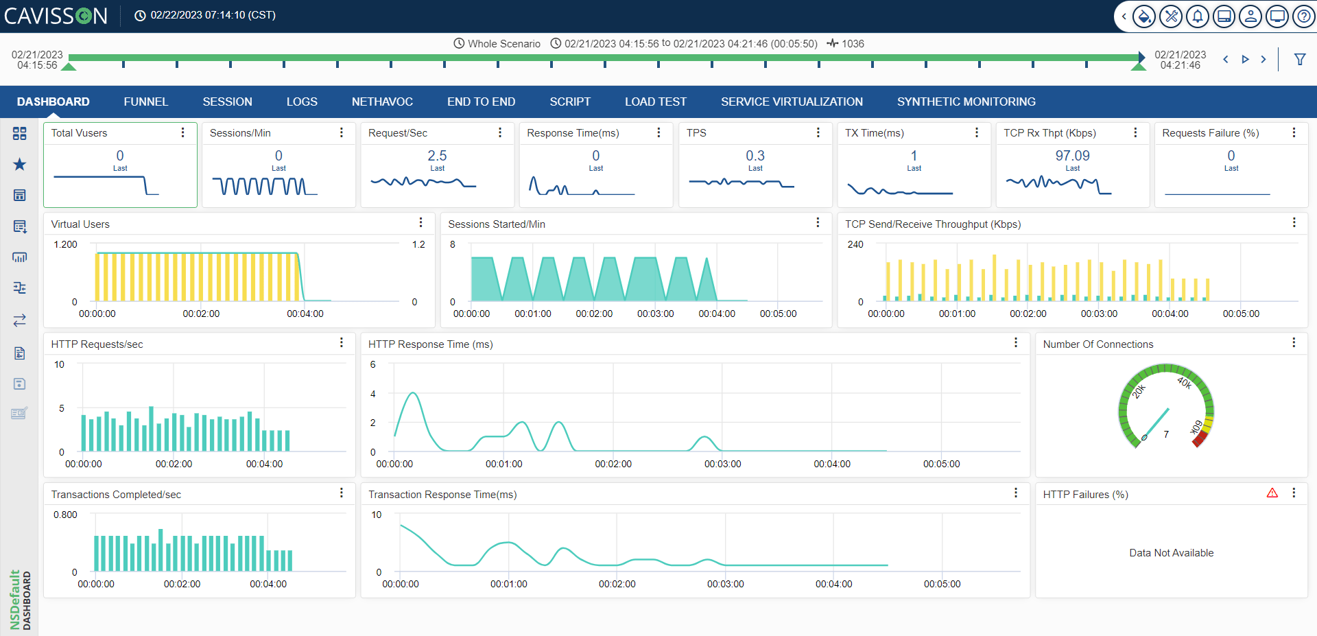
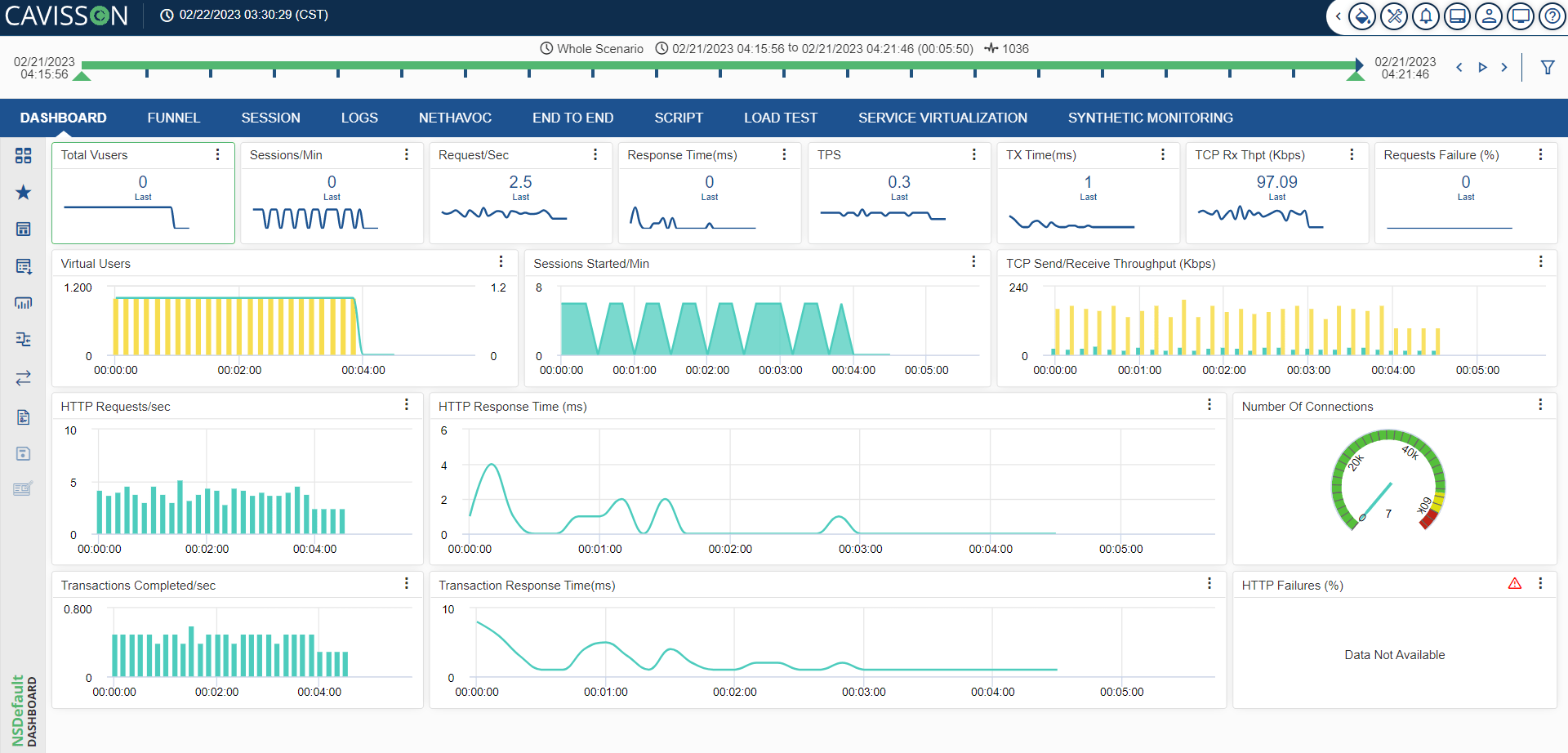
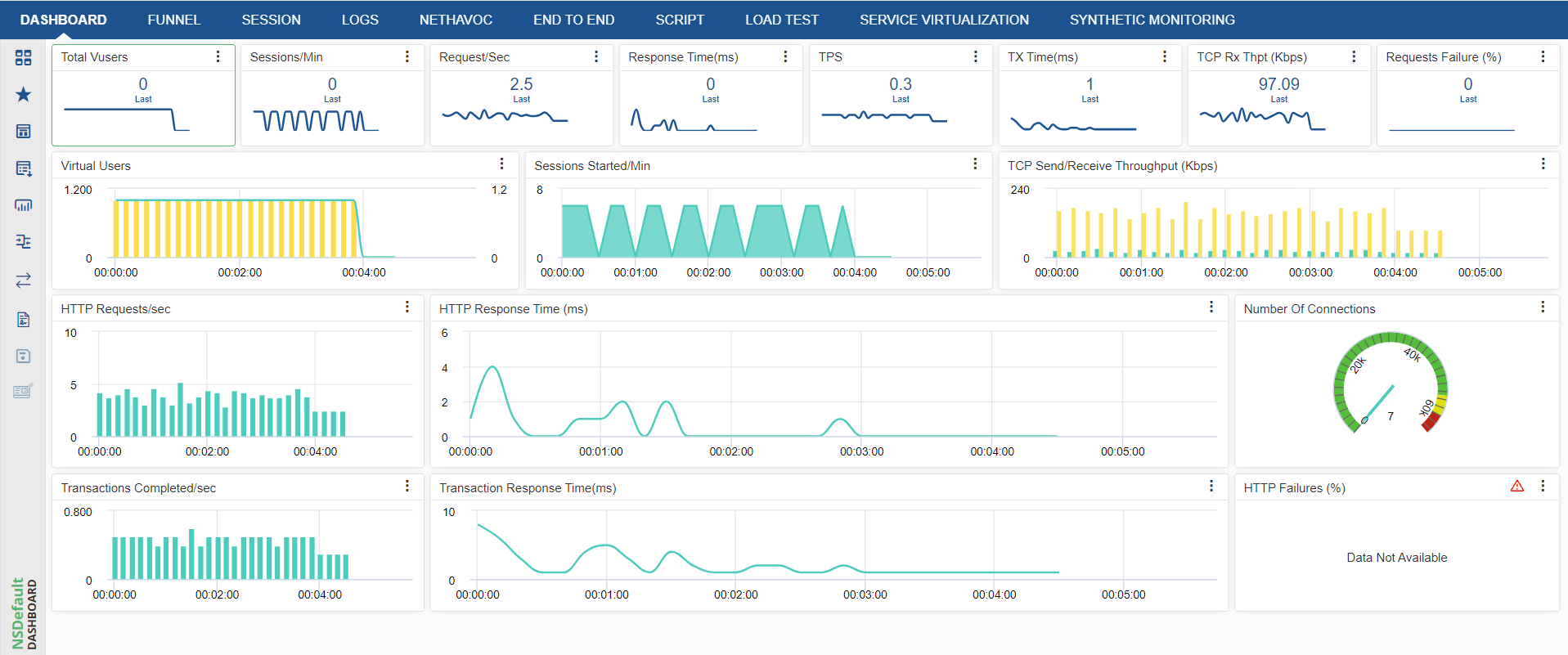
Global Time Period
It is the time period that is applied globally for all the widgets. This time period is selected from the Time Filter option and it is divided into four equal parts (with 5 bars in each part). You can select the time frame using the ![]() button. The total time frame is displayed in blue color, out of which the current time frame is displayed in green color. At both ends, the start and end time is displayed. At the top, it displays the time period, the current time frame, and the test run number.
button. The total time frame is displayed in blue color, out of which the current time frame is displayed in green color. At both ends, the start and end time is displayed. At the top, it displays the time period, the current time frame, and the test run number.

- To move to the previous segment, use the
 button.
 - To move to the next segment, use the
 button.
 - To start auto refresh of the data, use the
 button. The graph data is auto refreshed based on the sample interval time.
 - To stop the auto refresh, use the
 button.
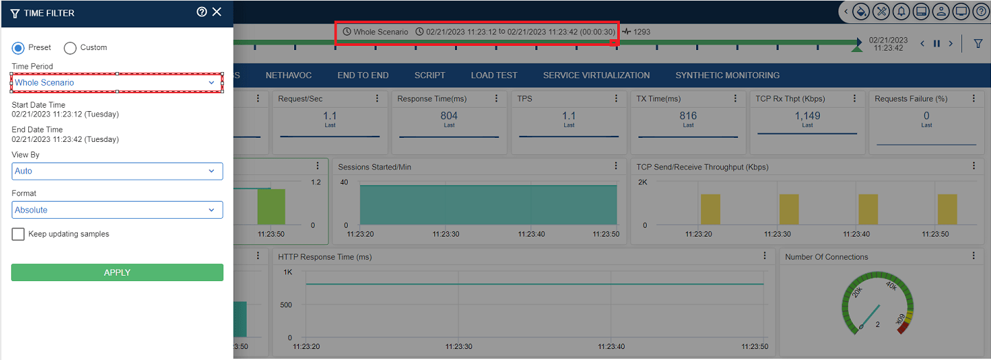
Time Filter
Time filter is used to apply filters based on some predefined or custom time. The graphs are displayed based on the applied time filters. To apply the time filter, the user has to click on the Time Filter ![]() icon.
icon.
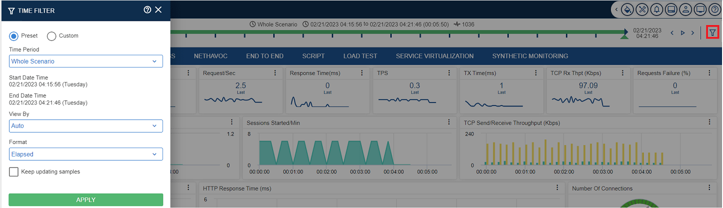
Preset
Preset is the period of one entity for comparison.
- Common for NetDiagnostics & NetStorm: Last 10 Minutes, Last 30 Minutes, Last 1 Hour, Last 2 Hours, Last 4 Hours, Last 6 Hours, Last 8 Hours, Last 12 Hours, Last 24 Hours & Custom.
- For NetDiagnostics Only: Today, Yesterday, Last 7 Days, Last 30 Days, Last 90 Days, This Week, Last Week, Last 2 Weeks, Last 3 Weeks, Last 4 Weeks, This Month, Last Month, Last 2 Months, Last 3 Months, Last 6 Months, This Year, Last Year, Event Days, Hour Back, Day Back, Week Back, Month Back, Last Week Same Day & Last Month Same Date.
- For NetStorm Only: Specified Phase & Whole Scenario.
There are following options within Preset:
- Live: To view live data. For example – Last 5 minutes, Last 10 minutes, Last 30 minutes, Last 1 hour, Last 2 hours, Last 4 hours, Last 6 hours, Last 8 hours, Last 12 hours and Last 24 hours.
- Events: To view data for some specific events. For example – Black Friday, Christmas Day, Good Friday, Cyber Monday, New Year’s Day, President Day, Thanksgiving day, and Valentine’s day.
- Specified phase: Select the required phase. E.g.- Duration phase, Rampdown phase, Rampup phase, Stabilize Phase, Start phase.
- Custom Time Period: To fill the start & end date and time. It is enabled when you do not select the Preset option.
- View By: To specify the format of aggregated data (such as hours, minutes, and seconds) based on the selection of the Preset option.
- Format: To select the type of format to be used, this option is being used. A format can be of the following two types:
- Elapsed: On selecting this, it will display the total time duration for which the test has run.
- Absolute: On selecting this, it will display a particular time from the total time duration for which the test has been run.
Note: For continuous updating sample value, the user has to select the Keep Updating Samples
 checkbox.
Example – Time Period Whole Scenario